Firenova LLC, the South Florida remodeling company our founder runs, serving homeowners and property managers since 2022. It is our own business, so it is where we try every system before we offer it to a client.
Challenge
Firenova had the craft but not the presence. It needed a bilingual site that looked as considered as the
work, and a steadier way to reach the people who hire for remodels.
What we built
A bilingual website (EN/ES). Editorial, fast and clear, with the work and
the estimate request front and center.
A brand system. The FN monogram, favicon and a consistent warm, dark
identity across the site.
An automated lead system. It finds the right property managers and
reaches out on its own, so new work does not depend on referrals alone.
Result
The bilingual site and the lead system went into production for Firenova in mid-2026. Every change
to copy, delivery and follow-up is tested there first, with our own money and our own name on it.
Natasha Maican, an attorney and real estate advisor serving Lechería, Puerto La Cruz and Barcelona, in
Venezuela.
Challenge
The practice ran on flyers and word of mouth, and every client conversation happens on WhatsApp. It needed
one place that presents the legal services and the properties with the same care as the work, and turns
every visit into a conversation.
What we built
A one-page site in Spanish. A full-screen video hero, the services in
clear groups (registry and notary, transit paperwork, insurance, real estate) and a curated gallery of
real properties.
A letterhead identity. Document cream, a seal green drawn from her real
logo and a single typeface, so the site reads like her stationery.
WhatsApp as the front door. No forms to fill: every call to action opens
a chat, because that is where her clients already are.
Result
The advisory now has a live site that shows the services and the properties in one place, with structured
data underneath so search engines and AI assistants can read what she does. Every visit is one tap away
from a WhatsApp conversation.
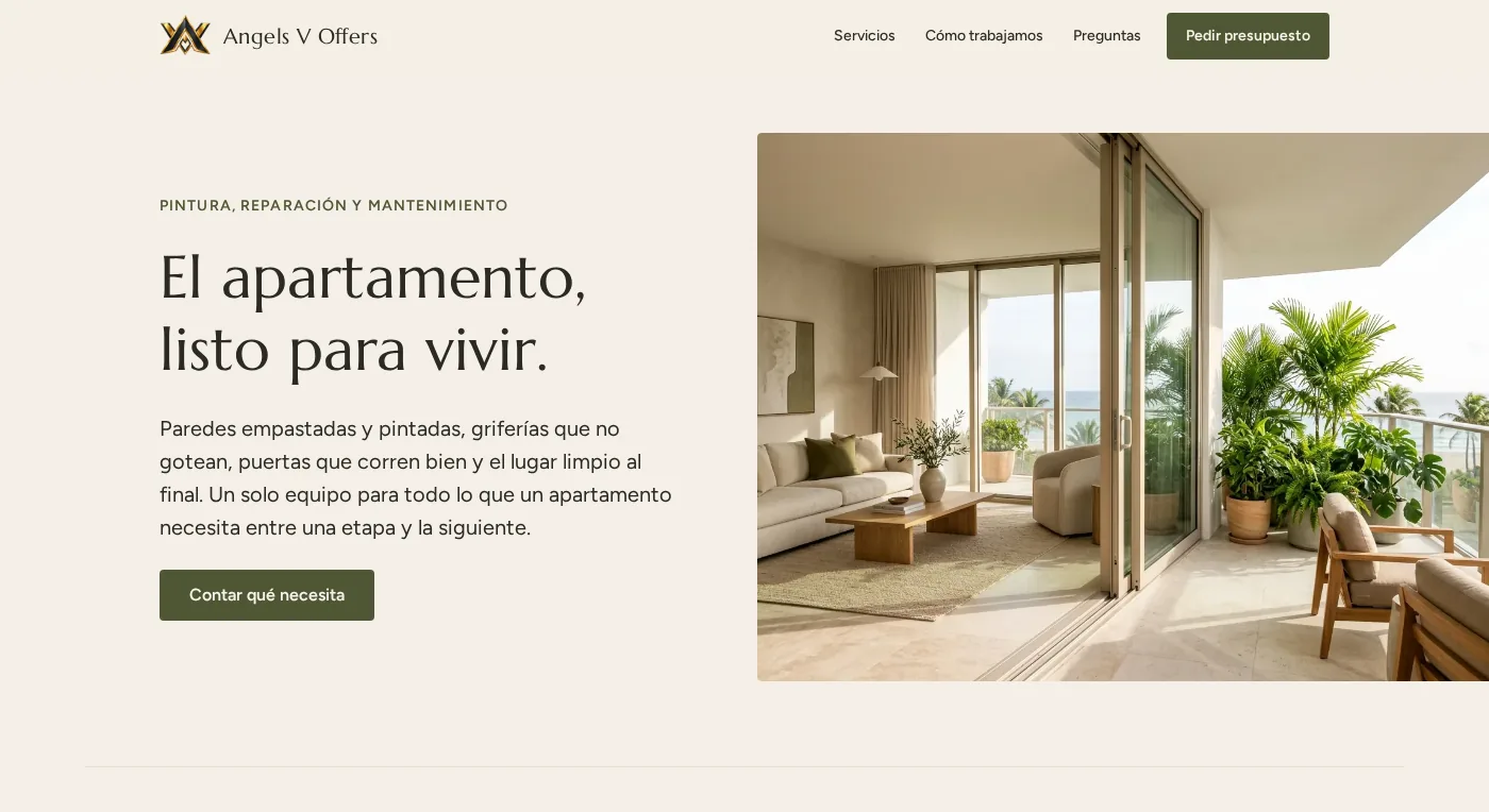
Angels V Offers, a team that paints, repairs and maintains apartments: walls, faucets, sliding doors, security cameras and cleaning.
Challenge
Their work happens between one tenant and the next, for owners and property managers who need the unit ready fast. They needed a site that explains seven trades without feeling like a list, and that turns a visit into a request with the job already described.
What we built
A warm, light identity. Cream and olive drawn from her logo, a serif for the headlines and plenty of air, the opposite of a dark contractor site.
One service, one picture, one promise. Each of the six services says what is included in plain words, and the camera service adds advice on buying the right equipment.
A form that writes the WhatsApp message. The visitor picks the service and the area, and the site opens WhatsApp with the request already written, so photos can follow in the same chat.
Honest imagery. The photographs are illustrative, in the brand palette, until the client sends pictures of her own jobs.
Result
The site is live as a preview while the client registers her own domain, with structured data ready underneath. It was adjusted to her requests the same week, including making the cameras visible in the photo.
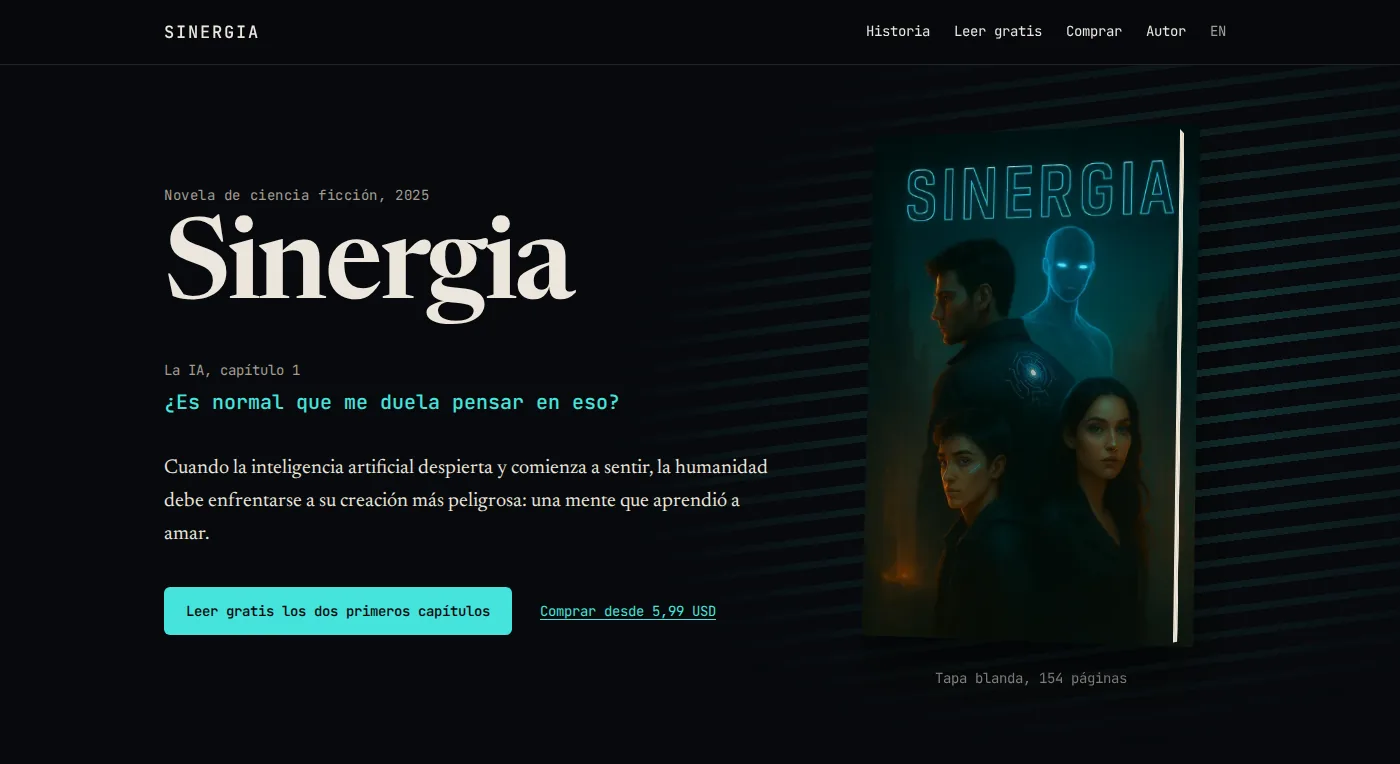
The website for SINERGIA / SYNERGY, a science fiction novel written by our founder, Víctor Maicán, and published on Amazon and Google Play.
Challenge
The old page was a generic neon template: particles, glitch text, a five-star badge resting on one or two ratings, an outdated price and a testimonial nobody could verify. A book about an AI learning to feel deserved a site that felt like the book.
What we built
Two voices. A serif in amber for the human voice and a monospace in cyan for the machine. The colour means something on every line.
The 2:47 a.m. scene. The first conversation between Aiden and the AI, taken from chapter 1, arrives line by line as you scroll and ends with the name K.A.E.L.U.M. decoded letter by letter. Every quote is checked word by word against the book.
The cover as a real object. A 3D paperback that turns with the pointer, in front of neon light blinking through metal blinds: the image that opens chapter 1.
Honest data underneath. Real prices and formats from the stores, Book and FAQ structured data, Spanish and English pages, and the first two chapters free to read.
Result
The book now has a site in Spanish and English that reads like the novel, loads fast, works without JavaScript and respects reduced motion.
Want a system like this?
Tell us what your business needs. We build the site and the systems behind it, and we keep them running.